Why Baskin Robbins could have done better
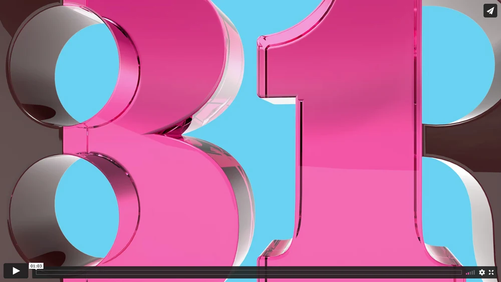
I was on LinkedIn when I first noticed a pink 3D ’31’ scroll past my feed.
I caught myself screaming in my head: “Why did they have to do this?”
I usually don’t have such a strong reaction to design work, but this was an exception.
Maybe it’s because somewhere deep down I always felt the ’31’ in their old logo was a secret between Baskin Robbins & me. Something I would casually bring up in conversations with non-design folks to see their eyes light up.
With the new rebrand, you can’t miss the ’31’ anymore. It’s obvious and had lost its charm.
But I wasn’t ready to give up yet. They must have spent an insane amount of time doing this & I wanted to love what they did, so I read on.
Their new identity is inspired by the slab serif logo they had in 1947.
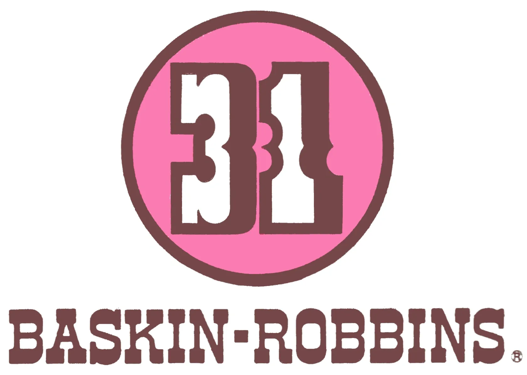
Baskin-Robbins logo in 1947
In theory, it’s a great idea: Rediscovering their roots & dialing it back to what made the company great in the first place. Sprinkling in some of that nostalgic magic.
But not this time, this feels like a downgrade from what they used to have.
As a brand identity designer, I like when a brand has enough unique assets to mix and match. This is one of the reasons I loved what they had.
Baskin Robbins’ old identity had a custom typeface with disproportionate letters & quirks, and to be honest I found that remarkable. A simple yet clever extension of their brand.
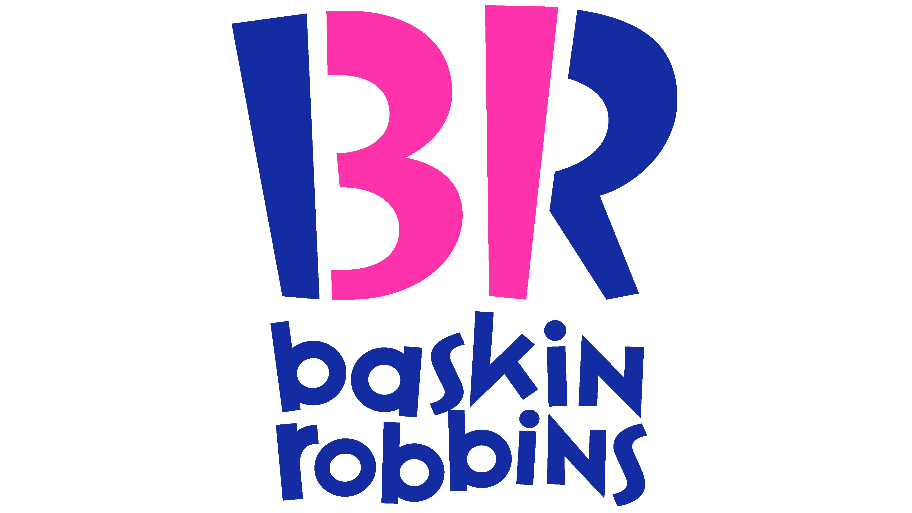
Baskin Robbins old logo
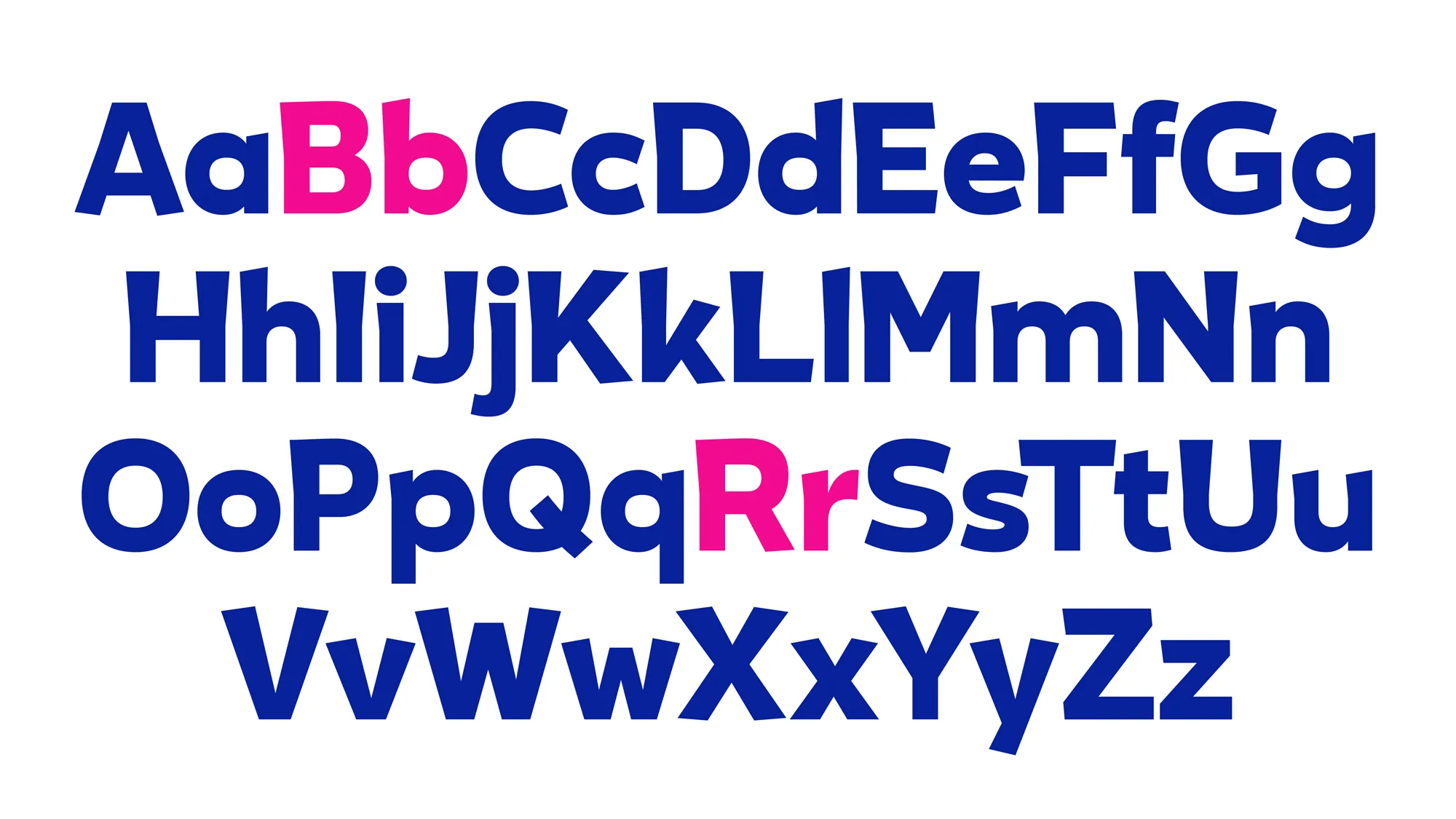
Baskin Robbins proprietary typeface they had with their old identity
But now, stripped down of all its quirks, and turned back in time, it lacks the appeal it once had.
A serif & slab serif combination just doesn’t cut it for me. For a brand with ‘31’ flavors of ice cream, this feels like plain vanilla.

But then, if the work evokes a strong reaction (good or bad) it’s usually a good sign. If some people don’t like it, it implies some people would really like it.
What you don’t want is something that evokes no reaction. So in that sense, I think they might be onto something here!