Fedo
Brand identity, character design & app UX/UI for a preventive healthcare startup
Pre-Series A raised, led by Unicorn India Ventures (2020)
The Context
Fedo is a preventive healthcare brand focused on "feeling good, doing better".
We designed the identity, the Fedo character and the app around 2016, before the company launched. Fedo has since grown into a health-tech company and raised a $1M pre-Series A round led by Unicorn India Ventures.
The Logo
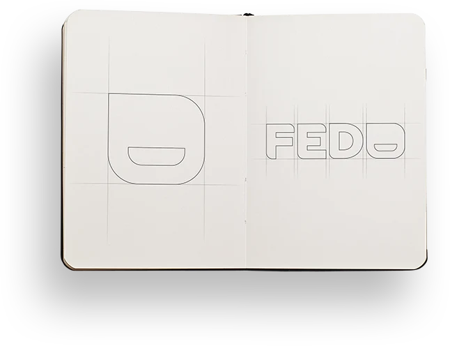
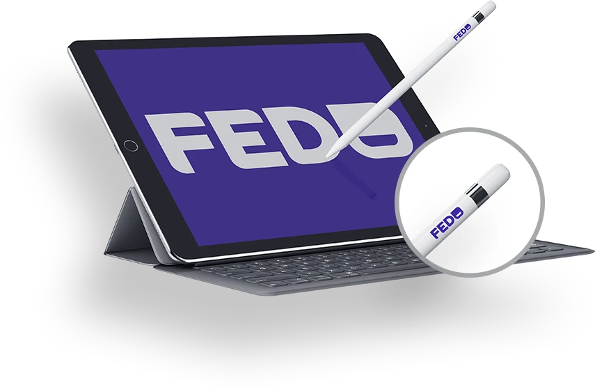
We focused on crafting a logo that was simple, happy and meaningful: distinctly visible at the smallest sizes, yet scalable without any distortion.
The Character
Shape and design consistency was maintained from the typeface to the character design, to ensure a single design approach across all brand touchpoints.


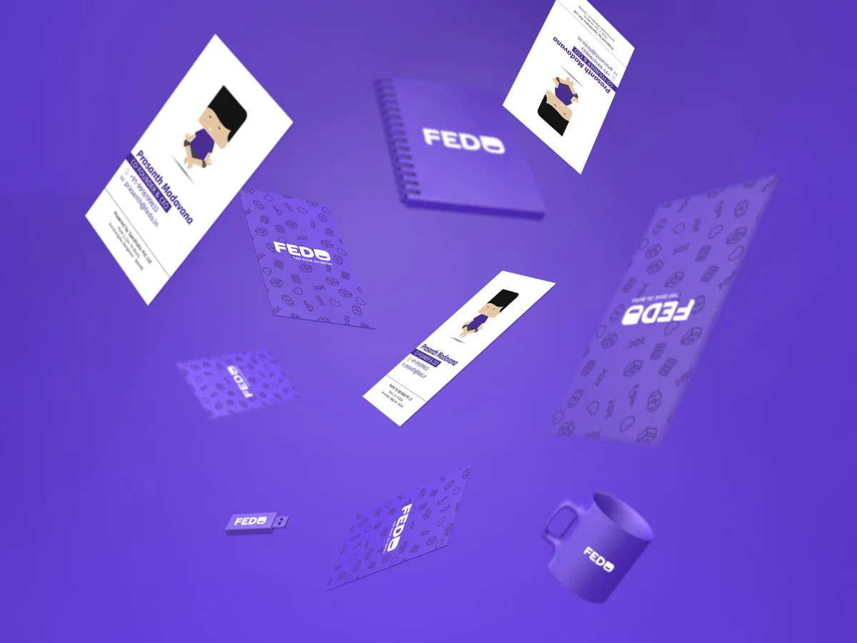
Brand Touchpoints
The App
The main goal of the app is to help you get better: physically, mentally and spiritually.
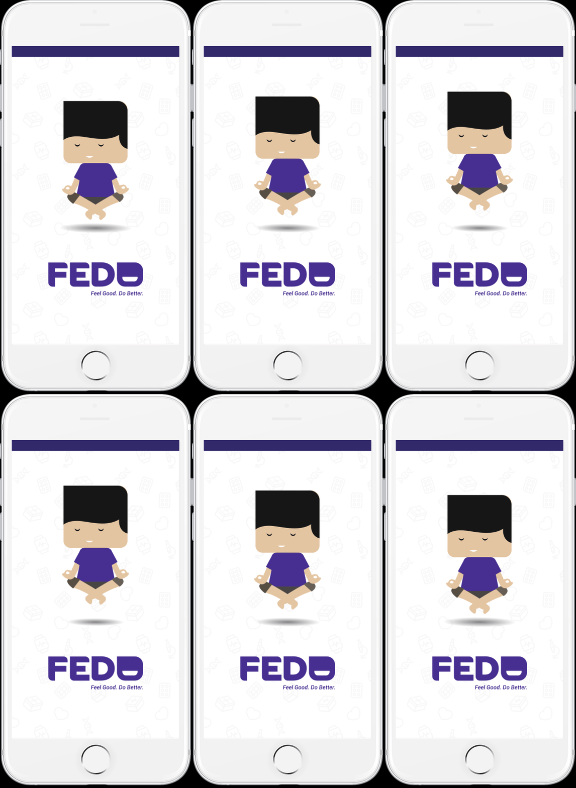
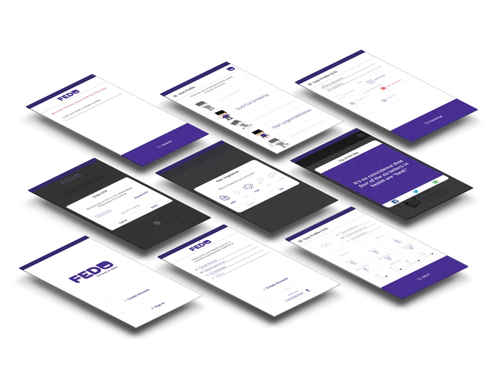
I. The splash screen: the Fedo character levitates as the app loads, building a feeling of peace.
Main & Profile Screens
II. The main screen: a dashboard with your Fedo Score and a tip to keep yourself healthy. It shows your daily progress on health and lifestyle goals, and a card of articles to help you feel good and do better.
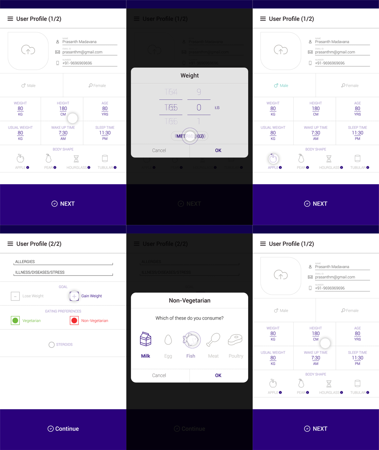
III. The profile screen: captures everything needed about the user in a neat, clean and user-friendly form.

Goals & Articles
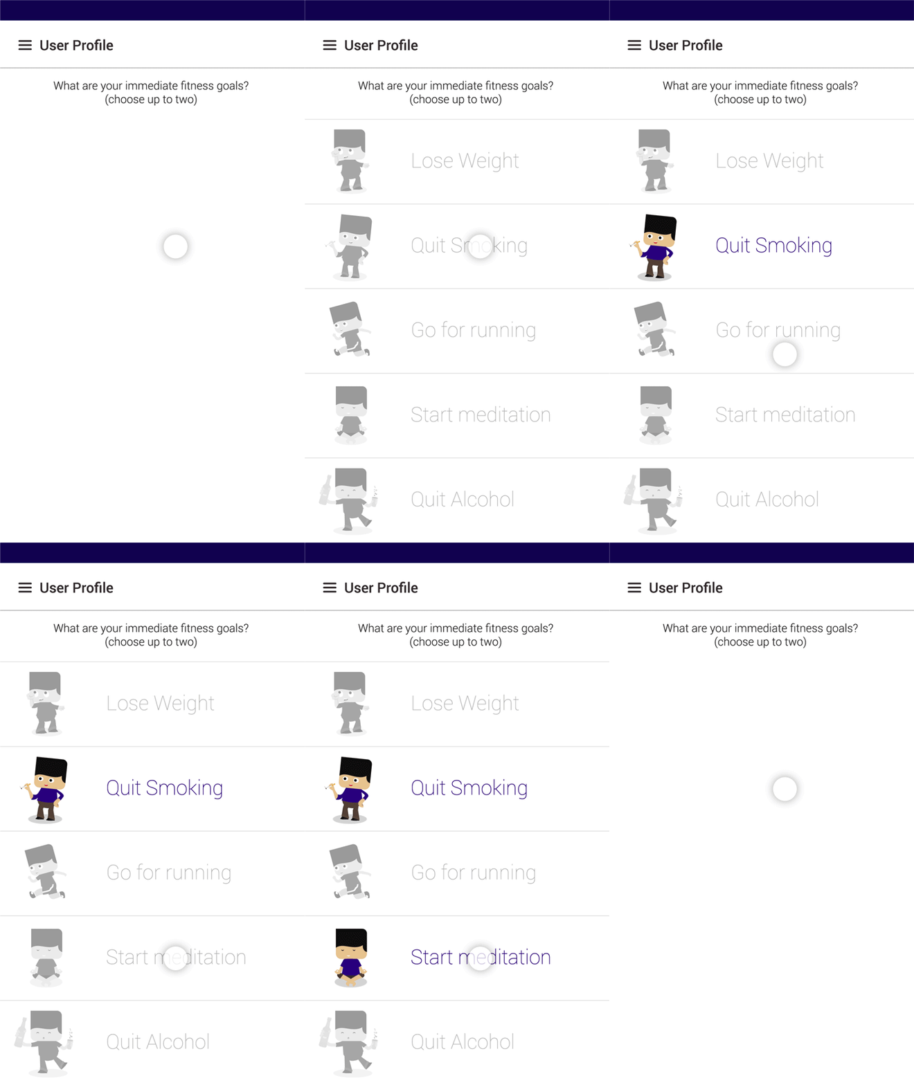
IV. Goal selection: pick a goal to pursue, either a lifestyle goal or a daily health goal.
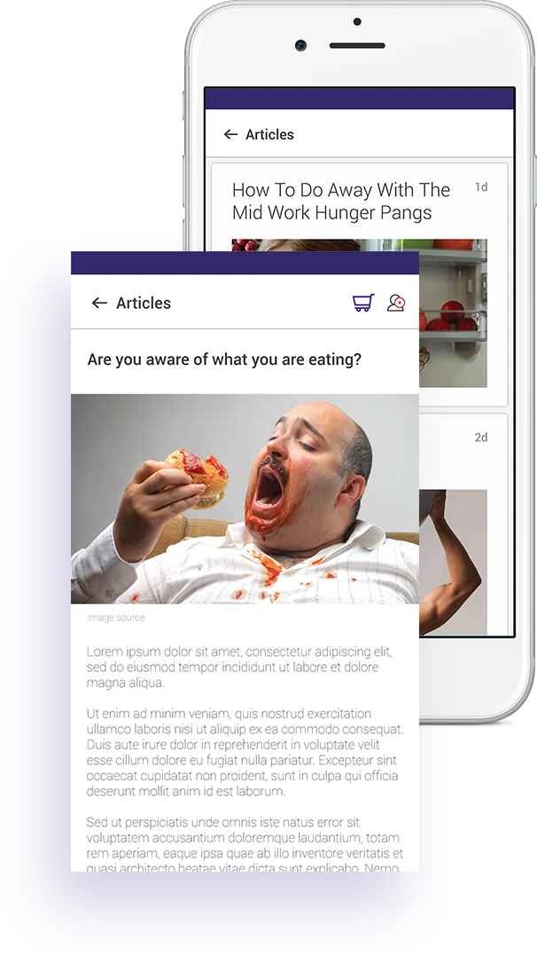
V. The articles screen: Fedo wanted high-engagement informational pieces at the core of its offering. We designed an interface for distraction-free reading that encourages longer reading time.