Growing Goodness
Brand identity & packaging for a hydroponic farming brand
The Context
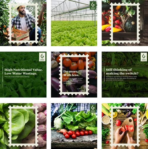
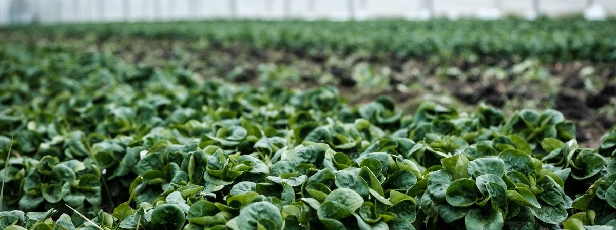
Growing Goodness started with a mission to reduce the damage to the environment, using hydroponic farming techniques that use 90% less water to grow highly nutritious crops.
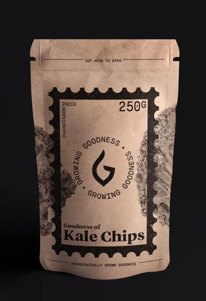
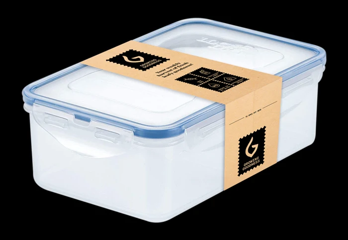
Biban, the founder, approached us to create packaging that would look premium and entice millennial consumers to choose it over the more adulterated produce in the market.
The Opportunity
The brand name was really interesting: it could be used in a variety of "I" & "We" sentences, which would make the brand very personal.
We are Growing Goodness. I am Growing Goodness. We all are Growing Goodness. I will be Growing Goodness. Growing Goodness for all of us.
We are Growing Goodness in Punjab. We are Growing Goodness in Delhi now. We are Growing Goodness in Mumbai next.

The Icon
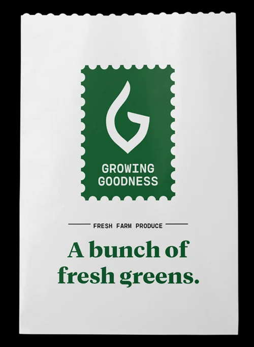
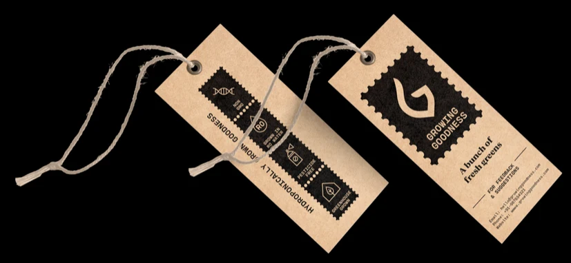
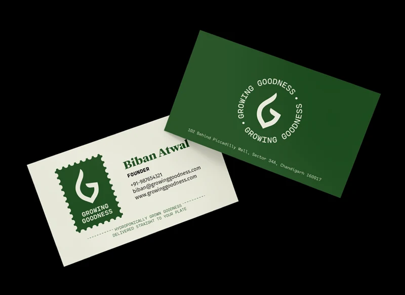
The icon brings together the brand initial G, green leafy vegetables, and a gesture for doing good.



The Visual Identity
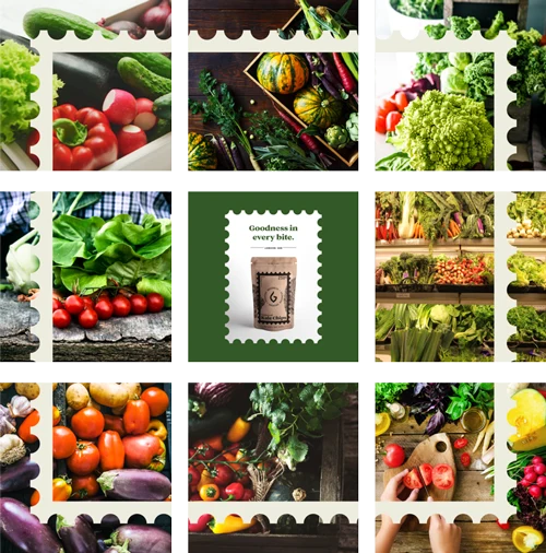
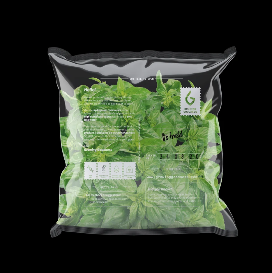
Our research took us back to the olden days, when farm produce was fresh and unadulterated. We set out to capture the nostalgia of those times.
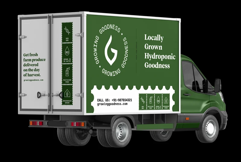
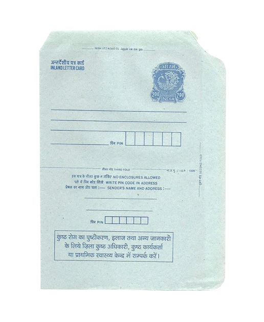
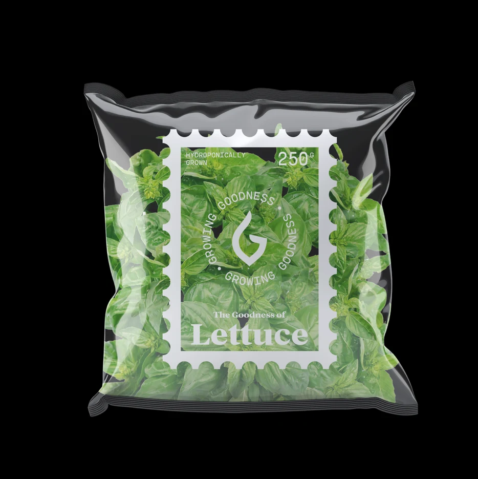
The Indian inland letter card felt like the perfect visual metaphor. Elements found on those letters were used to recreate that nostalgic connection for the brand.

Branded Assets









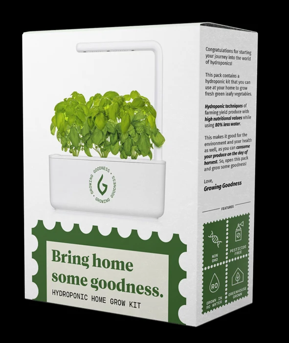
Packaging



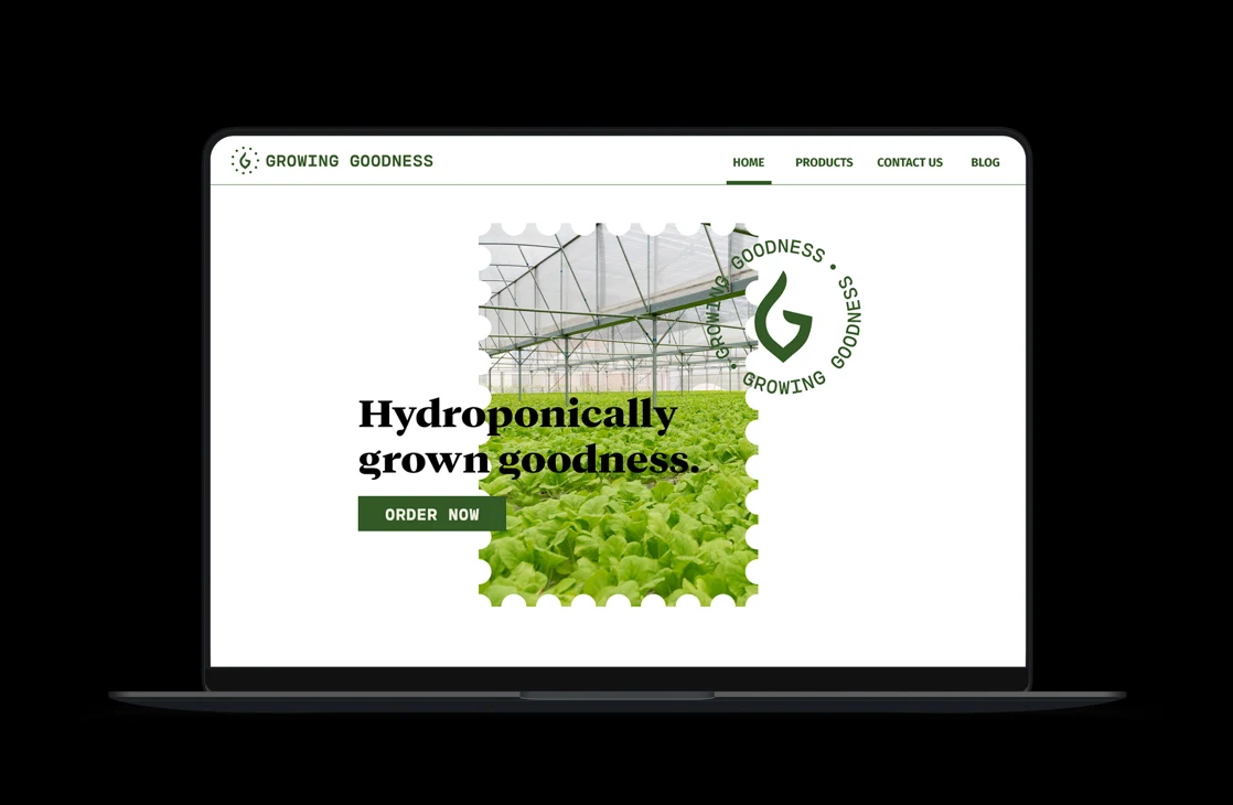
Brand Touchpoints