
CII Design Excellence & 4 more
Brand Identity
Electric Mobility
Yulu Bikes
Brand identity for India's largest shared micro-mobility service provider
THE CONTEXT
Yulu Bikes is India’s leading electric micro‑mobility service provider.
They offer short‑distance e‑bikes and cycles to solve last‑mile and first‑mile commute challenges.
As the company evolved from a cycle-sharing startup into a larger urban mobility platform, it needed a brand that could grow with it. One that reflected its purpose, scale, and vision for the future of sustainable transport.
The old logo cued a cycle brand
THE CHALLENGE
The existing identity had two major flaws:
It was hard to read (often misread as “Cyulu”)
It visually anchored to bicycles instead of sustainable mobility.
We had to help Yulu shift perception from a bike brand to a broader, sustainable transport operator, without losing clarity or flexibility.
Old logo could be read as 'Cyulu'
Yulu was positioned as a cycle brand
THE BIG IDEA
Yulu isn’t just about bikes: it’s about bridging gaps in India’s urban commute.
Yulu is the link that completes the transportation chain.
THE LOGO
At the heart of the rebrand was a critical correction.
The old logo often got misread as “Cyulu” and visually leaned too hard on bicycles.
The new logo is simple enough to scale, distinct enough to own & meaningful enough to stand the test of time.
THE VISUAL LANGUAGE
Beyond the logo, the identity system used the link as a unifying design element.
This motif appeared across illustration, motion, and layout, gaining meaning through how it moved or morphed.
To ensure consistency, we developed a cohesive illustration style using monochromatic backgrounds in light or dark mode.
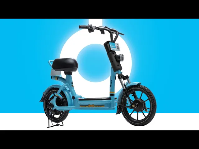
This allowed the Yulu Bikes to stand out and was applied across the website and app onboarding to guide users through the experience.
If this is the distance someone has to travel,
Yulu solves for the gaps in public transport
So, if this is the distance someone has to travel,
Public transport takes you close, but not all the way
Yulu fills in these gaps
Yulu is the link that completes our public transport
This link is an integral part of our visual language
Light mode illustrations
Dark mode illustrations
SCALABLE SYSTEM
The link motif became an expressive asset that could carry the brand without the logo.
It’s flexible enough to adapt, yet distinctive enough to stay recognizably Yulu, across sizes, surfaces, and screens.
Paired with the illustration style, typography, colors and logo together create a truly scalable system.
TEAM
Anand CV
Jithin Vijay
Sreejith Surendran
Alen Thomas
Shrawan Sundi
Arun Gopidas


