
Indigo Awards, Amsterdam x2
Brand Identity
Fintech
Grit
Brand identity for a pre-payday wage access platform
THE CONTEXT
Grit provides instant earned wage access to American workers at no cost to them or their employers. By doing so, they help reduce financial stress for both businesses and workers.
As a social impact brand, their mission was clear: help American workers to live with dignity, security, and opportunity.
They reached out to us to create a cohesive brand identity system that could encapsulate their offerings and ambitions.
THE CHALLENGE
While their purpose was strong, and their name was meaningful, the brand needed a distinct identity.
The opportunity was to move beyond mere financial transactions and build a brand that embodied true empowerment: helping workers break free from cycles of debt, fight for their rights, and achieve their dreams.
The challenge was to design a brand that could balance social impact with trust and scalability.
Building a brand that embodied true empowerment
THE BIG IDEA
We started by defining the brand anchor: Empowering American Workers.
This became the core around which everything else revolved. It reflected not just the service Grit provided, but also the aspirations it unlocked: respect, security, freedom, and possibility.
From there, we explored visual directions that could embody empowerment while remaining simple, scalable, and memorable.
Empowering American Workers
THE LOGO
The Grit logo fuses the brand’s initial “g” with a powerful fist.
An unmistakable symbol of empowerment and solidarity.
This combination transforms the logo from a mere identity marker into a visual affirmation of Grit’s mission: to uplift, enable, and champion every American worker.
Early logo explorations
The idea behind the identity
Adaptive logo system
THE VISUAL LANGUAGE
The visual identity draws inspiration directly from the word “grit” & the imagery associated with it.
We explored the raw texture of gritty, sandy stone, to use as a tanglible, visual metaphor.
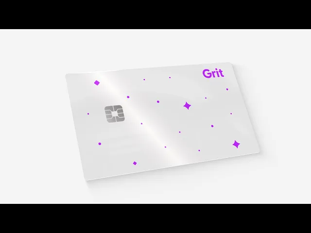
We simplified it to three geometric forms, what we call “pieces of grit.”
Coincidentally, when repeated, the three pieces closely resemble stars in a night sky.
This dual symbolism was powerful. Stars evoke feelings of peace, relief, and the infinite possibilities that financial stability can create.
Texture inspired by the name of the brand
The three pieces of Grit
Custom icons for a cohesive system


